
MyHelper


Project Overview
Project description
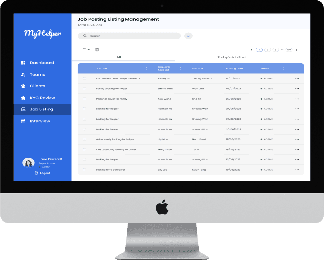
MyHelper is an app that provide a recruitment platform for employees to hire the domestic helper. While the goal of our team is to create an efficient and user-friendly interface for operation level users to manage and track job postings posted by the employers
and manage the interview schedules and bookings of the domestic helpers who want to apply for Premium member status
Client
Darmax Global
My Role
Wireframe design
UI reference research
Usability testing
Timeline
27 June - 25 July (1 Month)
Design process
Meeting with client
UI research
IA & Userflow
Feature List
Design system
Lo-Fi &
Hi-Fi Wireframes
Usability Testing
Define
Ideate
Design
Refine
Define
Meeting with client
Firstly, we were received with the information from the client, including the Myhelper app prototype and
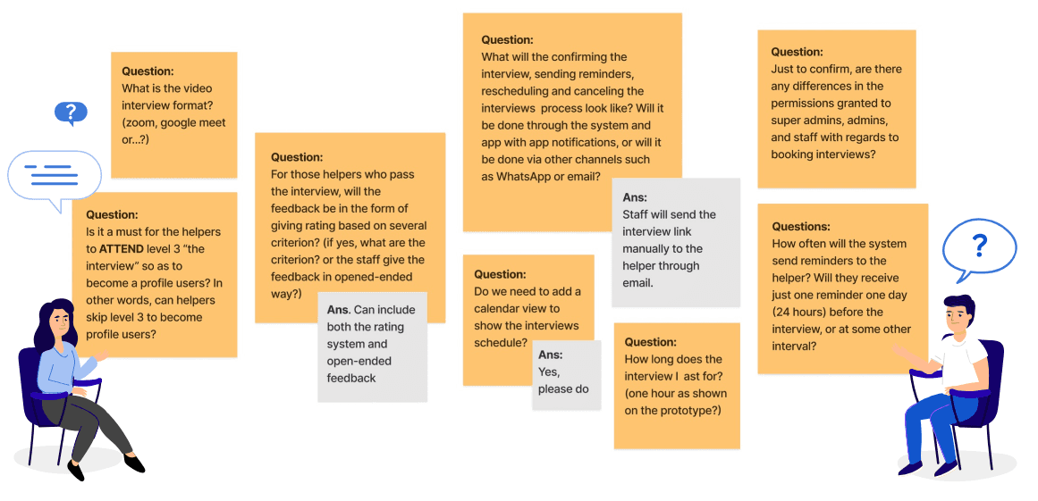
the app flow. We are responsible for designing the job listing and interview booking feature. However, we figure out there is still some part that is confusing. We then prepared a sets of questions to ask the client in order to clarify our ambiguity
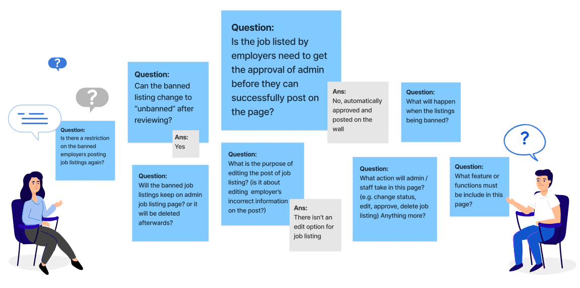
Requirement of the webpage
Job Posting Management
View status of all job postings at a glance (active and banned)
Can ban some posting jobs that is not appropriate
Remove irrelevant or unnecessary job postings
Ability to reinstate banned job posting
Interview Booking Management
View status of all interview bookings at a glance (active and banned)
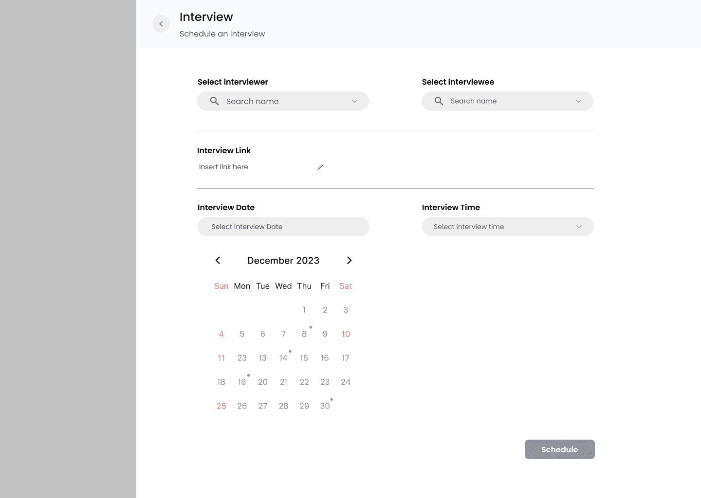
Manage interview bookings, including scheduling and rescheduling
A calendar view of all the interview booking
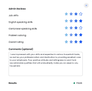
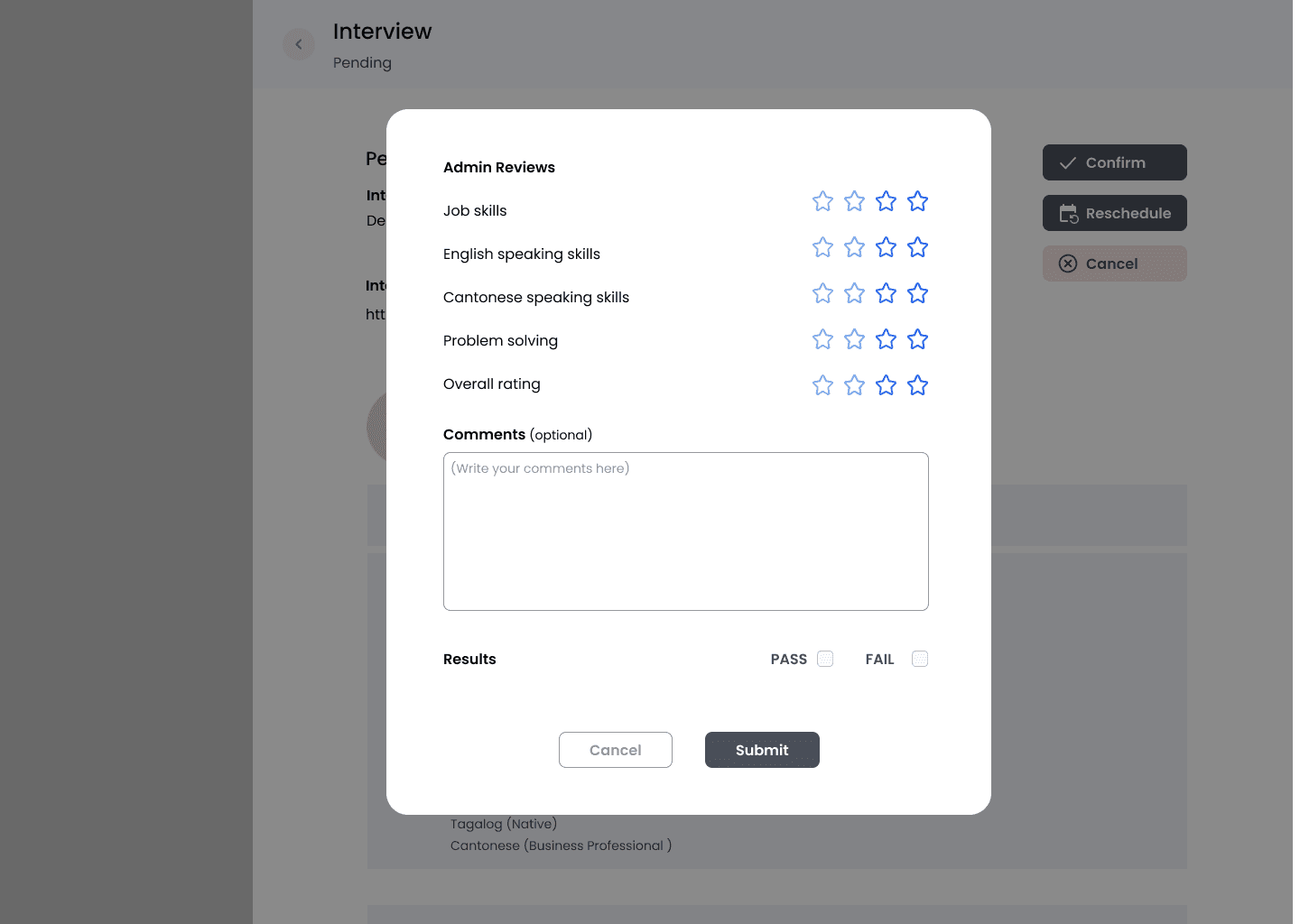
A function for admin to give and view feedback for finished interview


UI design reference
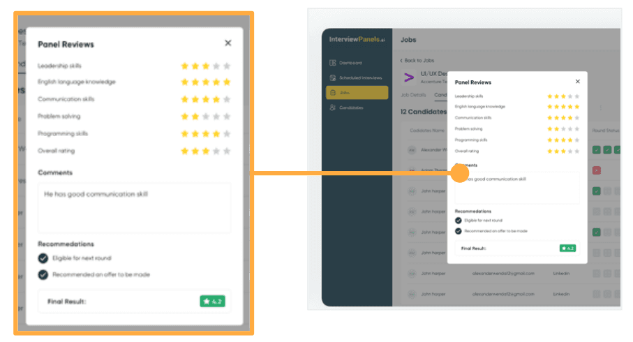
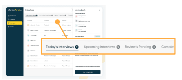
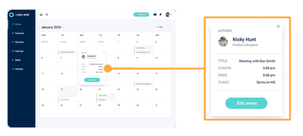
Below are some UI reference we found from some current apps, mobbins and behance, and we though some of the UI design can be quite useful for us to design some pages
Status label

Call-to-action button
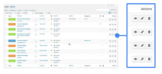
Feedback page
Navigation tab
Time picker
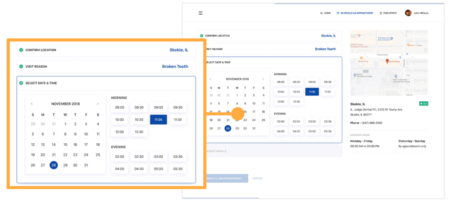
Calendar
Ideate
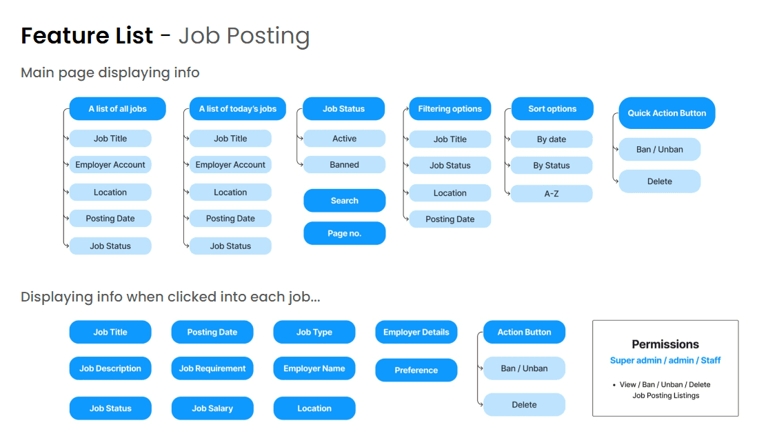
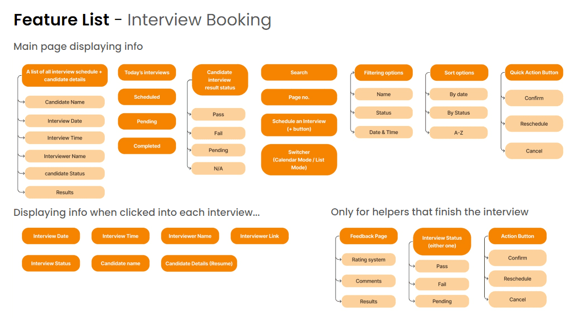
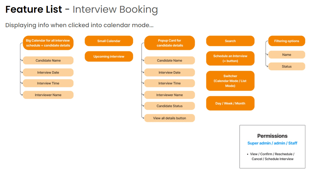
Feature List
To better identify what we elements we have to include, we make a feature list to list out all the possible information in every page, including the components, the icons and buttons.
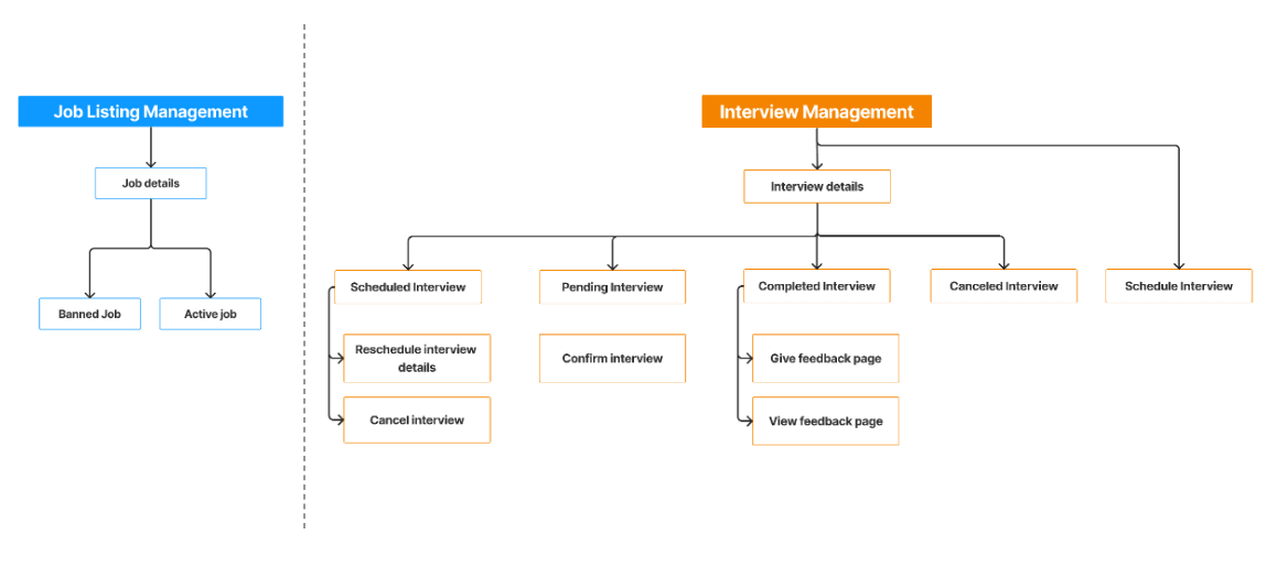
Information Architecture
Information Architecture focuses on organizing and structuring content to make it easily accessible to users. It deals with the organization, categorization, and labeling of information to create a coherent and intuitive user experience.
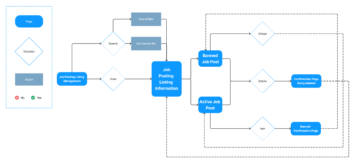
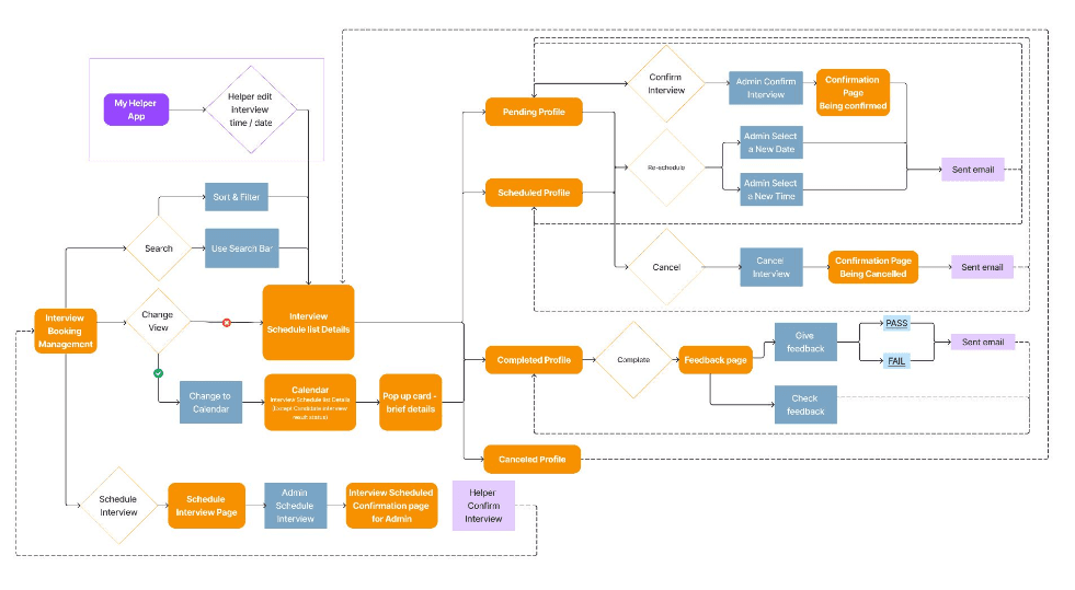
User flow
We create user flow in FigJam to illustrate how the users navigate through the app. The user-flow will be divided into the following 2 parts: the job listing feature and the interview booking feature
Job Listing
Interview booking
Design System
For the color system and typography, we will just stick to the system of the “Myhelper” app by using the dodger blue as the primary color and using poppins the typogoraphy.

Aa
Aa
Poppins
Lorem ipsum dolor sit amet, consectetuer adipiscing elit, sed diam nonummy nibh euismod tincidunt ut laoreet dolore magna aliquam erat volutpat. Ut wisi enim ad minim veniam, quis nostrud exerci tation ullamcorper suscipit lobortis nisl ut aliquip ex ea commodo consequat.
Headline XX-Large
Poppins
SemiBold
32px
/
auto
The quick brown fox jumps over the lazy dog.
Headline X-Large
Poppins
Medium
24px
/
auto
The quick brown fox jumps over the lazy dog.
Headline Large
Poppins
Medium
21px
/
auto
The quick brown fox jumps over the lazy dog.
H1 - Semi Bold
Poppins
SemiBold
16px
/
auto
The quick brown fox jumps over the lazy dog.
H2 - Medium
Poppins
Medium
16px
/
auto
The quick brown fox jumps over the lazy dog.
H3 - Regular
Poppins
Regular
16px
/
auto
The quick brown fox jumps over the lazy dog.
Title 1 - Semi Bold
Poppins
SemiBold
14px
/
auto
The quick brown fox jumps over the lazy dog.
Title 2 - Medium
Poppins
Medium
14px
/
auto
The quick brown fox jumps over the lazy dog.
Title 3 - Regular
Poppins
Regular
14px
/
auto
The quick brown fox jumps over the lazy dog.
Body 1 - Semi Bold
Poppins
SemiBold
12px
/
auto
The quick brown fox jumps over the lazy dog.
Body 2 - Medium
Poppins
Medium
12px
/
auto
The quick brown fox jumps over the lazy dog.
Body 3 - Regular
Poppins
Regular
12px
/
auto
The quick brown fox jumps over the lazy dog.
Small Text 1
Poppins
Medium
10px
/
auto
The quick brown fox jumps over the lazy dog.
Small Text 2
Poppins
Regular
10px
/
auto
The quick brown fox jumps over the lazy dog.
Tiny Text
Poppins
Medium
8px
/
auto
The quick brown fox jumps over the lazy dog.
Button
Poppins
SemiBold
16px
/
auto
The quick brown fox jumps over the lazy dog.
Label
Poppins
SemiBold
13px
/
auto
The quick brown fox jumps over the lazy dog.
Design
Lofi-Wireframe
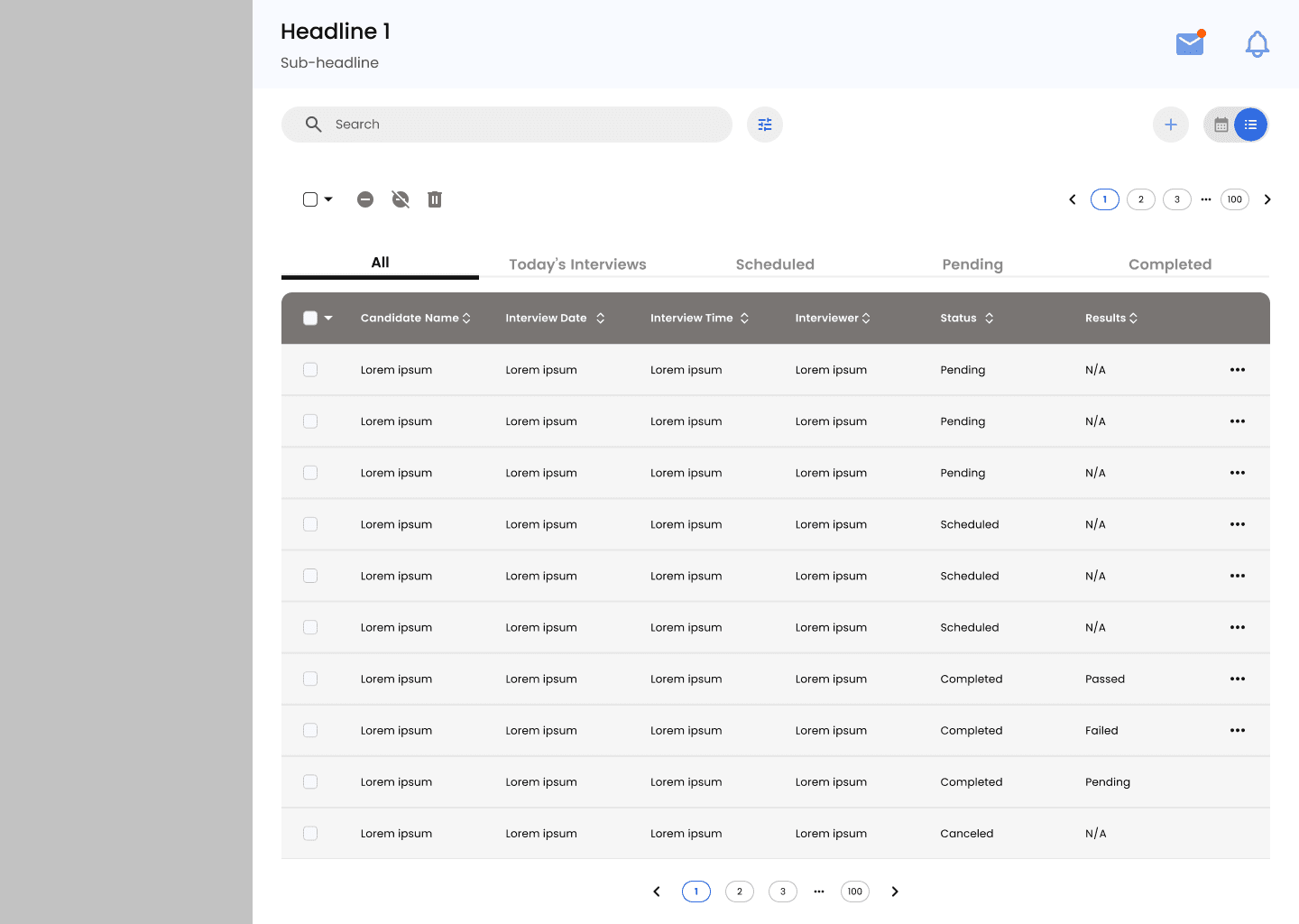
Overall Job listing page
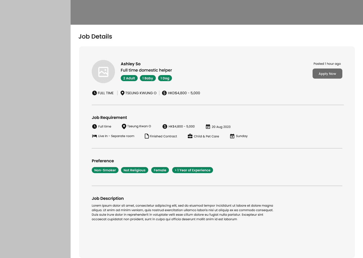
Specific Job listing detail page
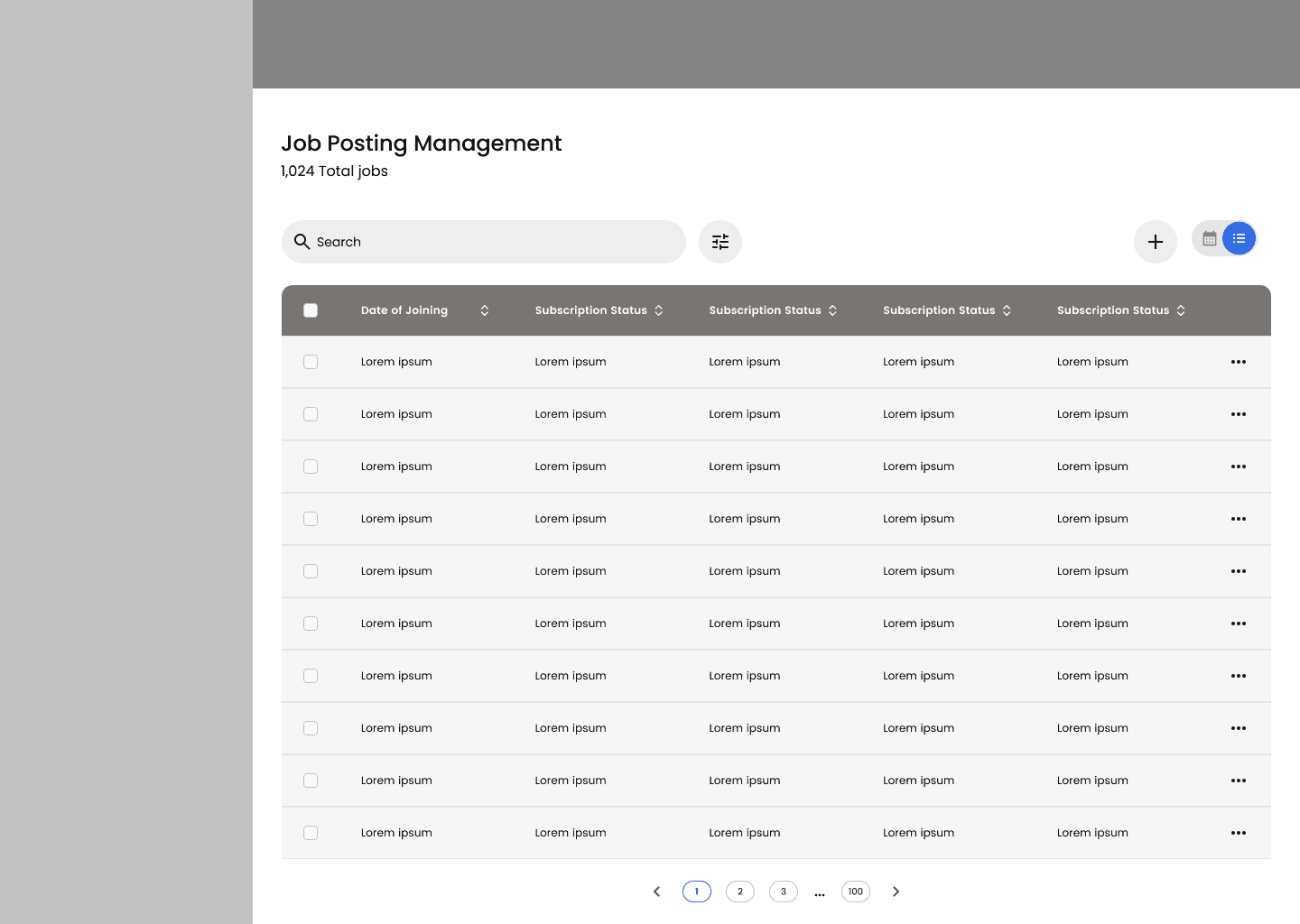
Overall Interview booking page (listing view)
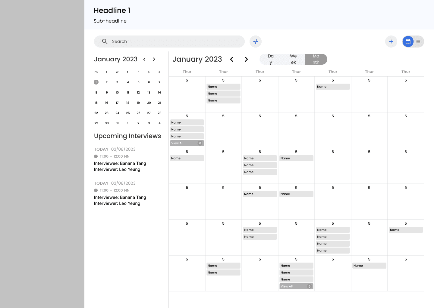
Overall Interview booking page (calendar view)
Specific Interview detail page
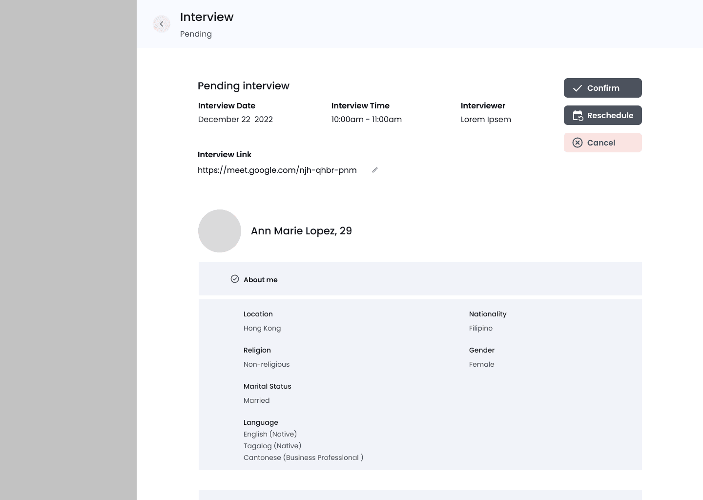
Schedule Interview page
Interview feedback review page
Refine
Usability testing
After finished designing the Hi-Fi prototype, we found 5 participants who are the Darmax Global Staff to conduct the usability testing. We use the website “Maze” to generate links of prototype and send the links to the participants for testing. The objective of the testing to understand whether users find the product easy to use and identify the users’ pain points on the website
Task of usability testing includes:
View a job post and ban it. Then try using the quick action function to unban the post
Schedule a new interview and give feedback for a pending result profile
Switch to the calendar mode and view the interview details
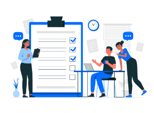
Here are some feedback for improvment after we summarize the opinions :
The overall interface is easy to use
The scrolling bar is difficult to scroll
Some text and icon is too small
The UI characteristic of the some buttons, text or lable is confusing
Refining prototype
Before
After
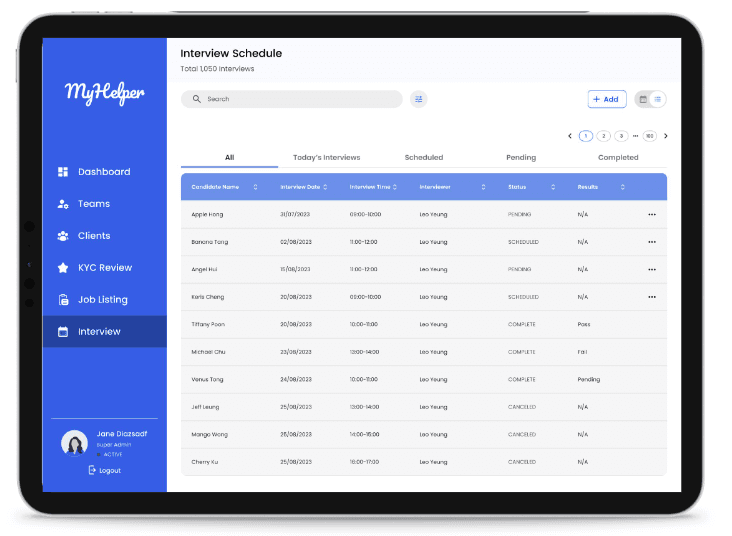
Status not easy to distinguish
Buttons cannot easily seen
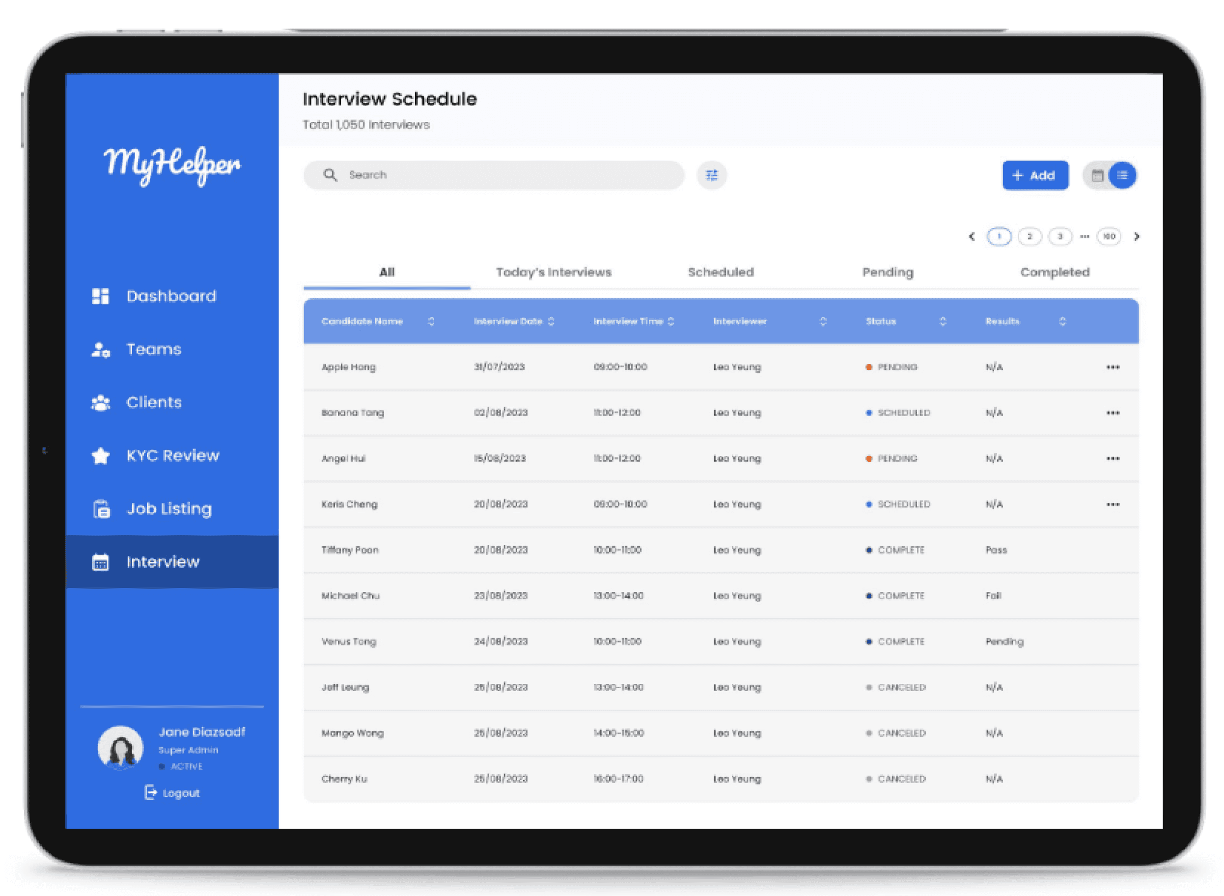
Added different colour dots for different status
Change to a higher contrast button
Before
After
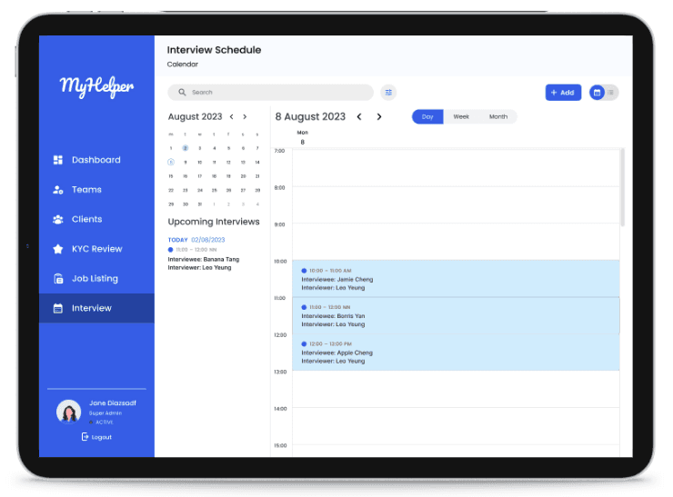
Scroll bar cannot easily used
Buttons cannot easily seen
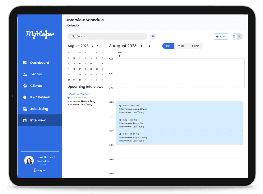
Change to a higher contrast button
Increase Thickness of
the scroll bar
Before
After
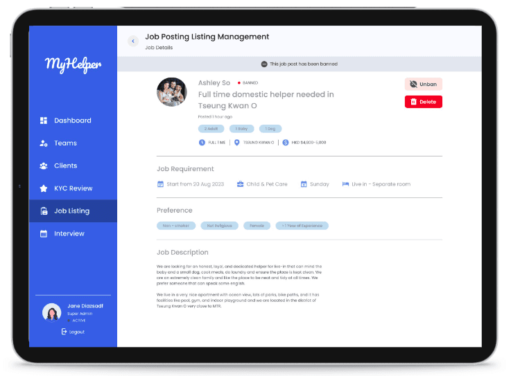
Notice bar in grey is merged with other details
Image is not in transparency
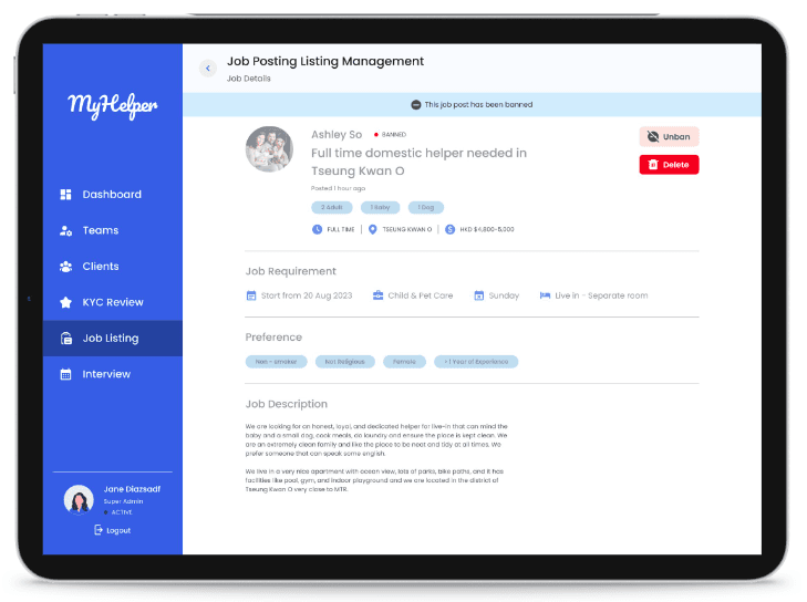
Use blue colour to show notice bar
Lower the transparency to show it’s banned
Hi-Fi prototype
Below is a video showing the overflow of how the users can navigate the features of the job listing and interview booking feature
What I have learnt
One of the major things I have learnt is related to usability testing. I have learnt that it is important to provide users with a brief introduction to the prototype to ensure they understand what they are using. When explaining the task, we should avoid saying some technical terms but need to explain in a manner that general people will understand. It is easier for users to complete the task if clear explanation is provided


~Thank you for scrolling and reading~
Please let me know your valuable feedback.

Next Project
Hollo DigiAct revamp

Hollo
DigiAct
UX Case Study
Hollo DigiAct revamp
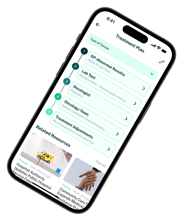
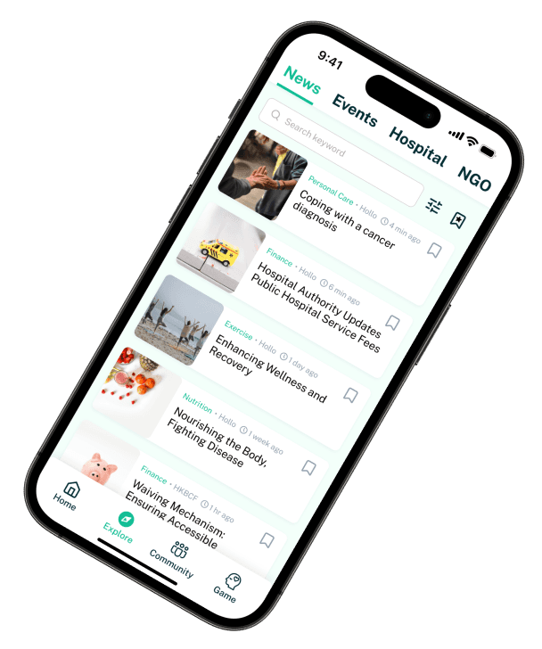
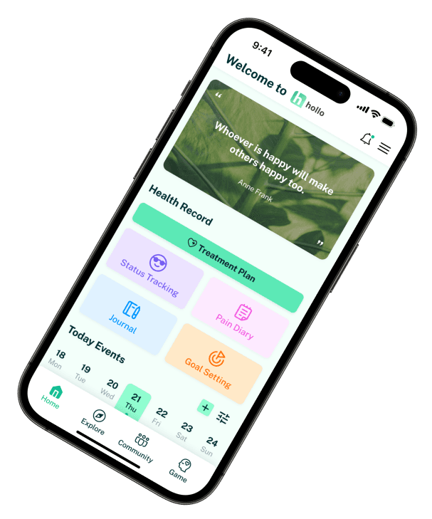
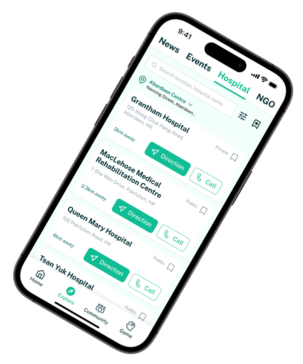
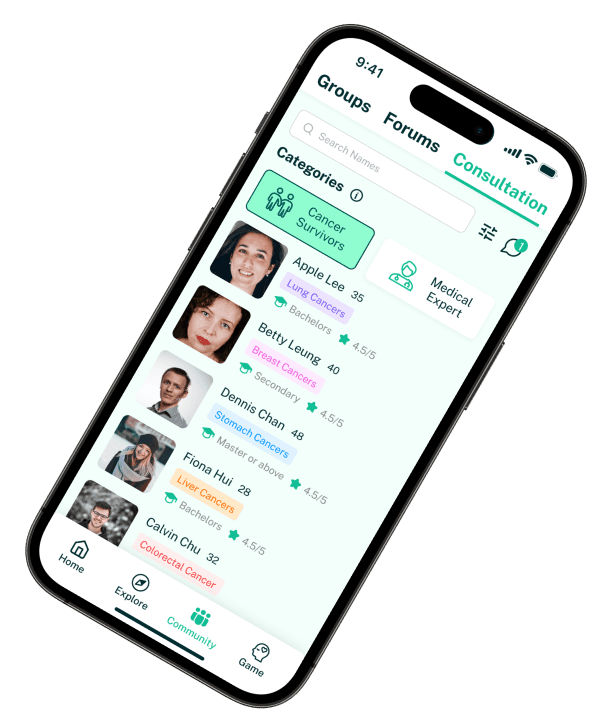
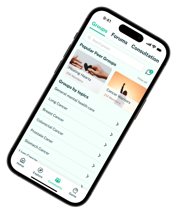
Revamp an cancer patients app to cater more for their needs
